Introducing xkcd Charts#
April 1, 2025
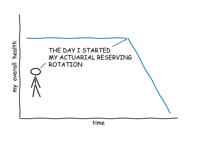
I am pleased to announce that this special release of FASLR introduces xkcd charts to brighten up your day. I know reserving might not be the most exciting part of actuarial science, as illustrated by this graph:
…which is why I have made it my mission to make reserving more exciting for those students awaiting greener pastures in predictive modeling or economic capital modeling. I’m already getting positive feedback as evidenced by this testimonial, which indicates that we’re moving in the right direction:
When I learned that I would be starting my reserving rotation, my heart sank. I have had it up to here with these goddamn triangles! Man, if I were going to be spending all day staring at a computer screen, I would have gone into investment banking instead…or maybe I would have just done LeetCode and gotten a job as a software engineer at a FAANG or something. At least then I’d have an equity stake.
I was about to give up all hope…but when I heard FASLR was coming out with xkcd charts, I realized that everything would be okay.
—April Fuhlz, Actuarial Analyst
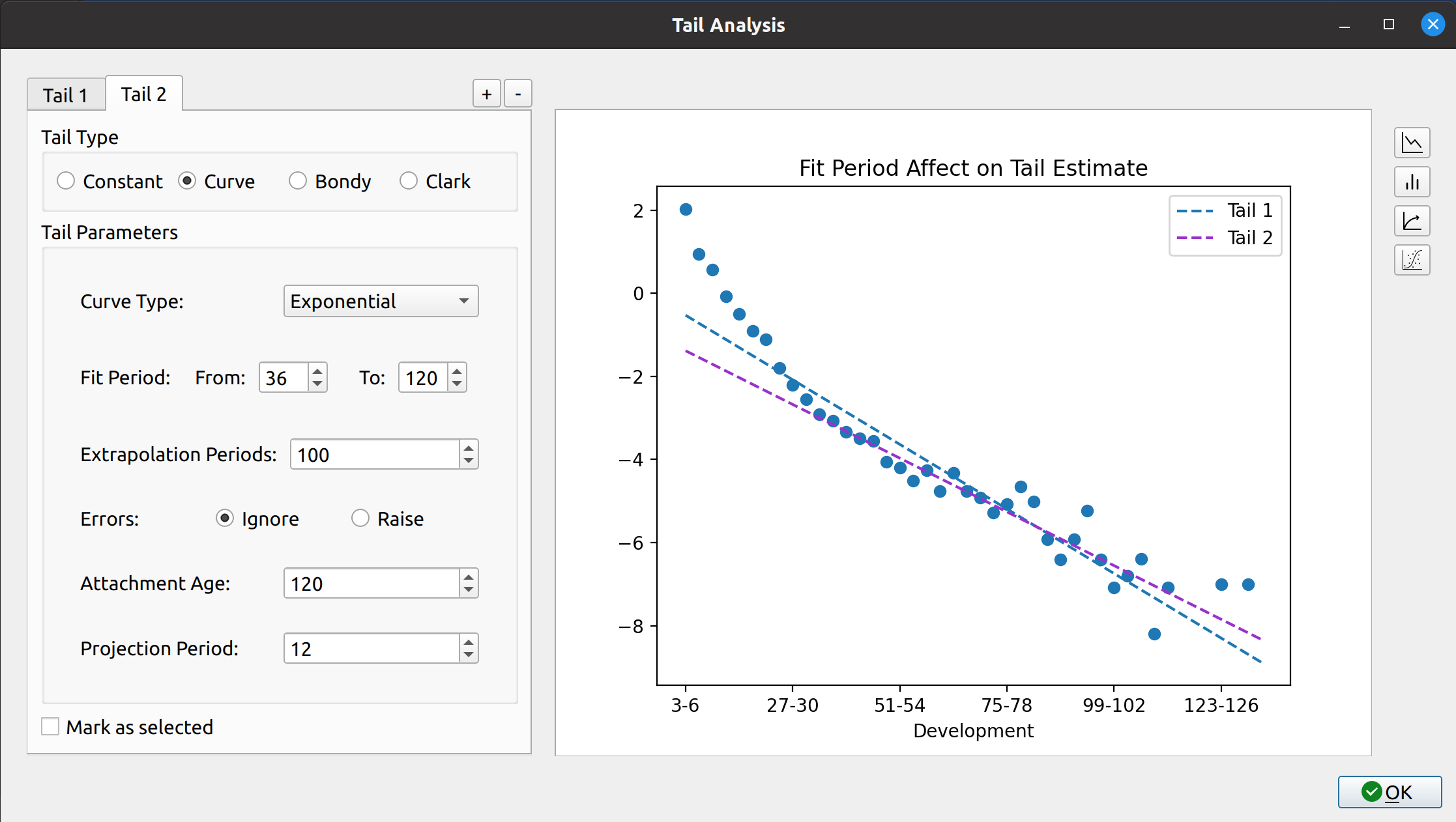
Yeah. I hear you. Well the good news is that introducing xkcd-style charts is as easy as a flip of the switch, turning this:
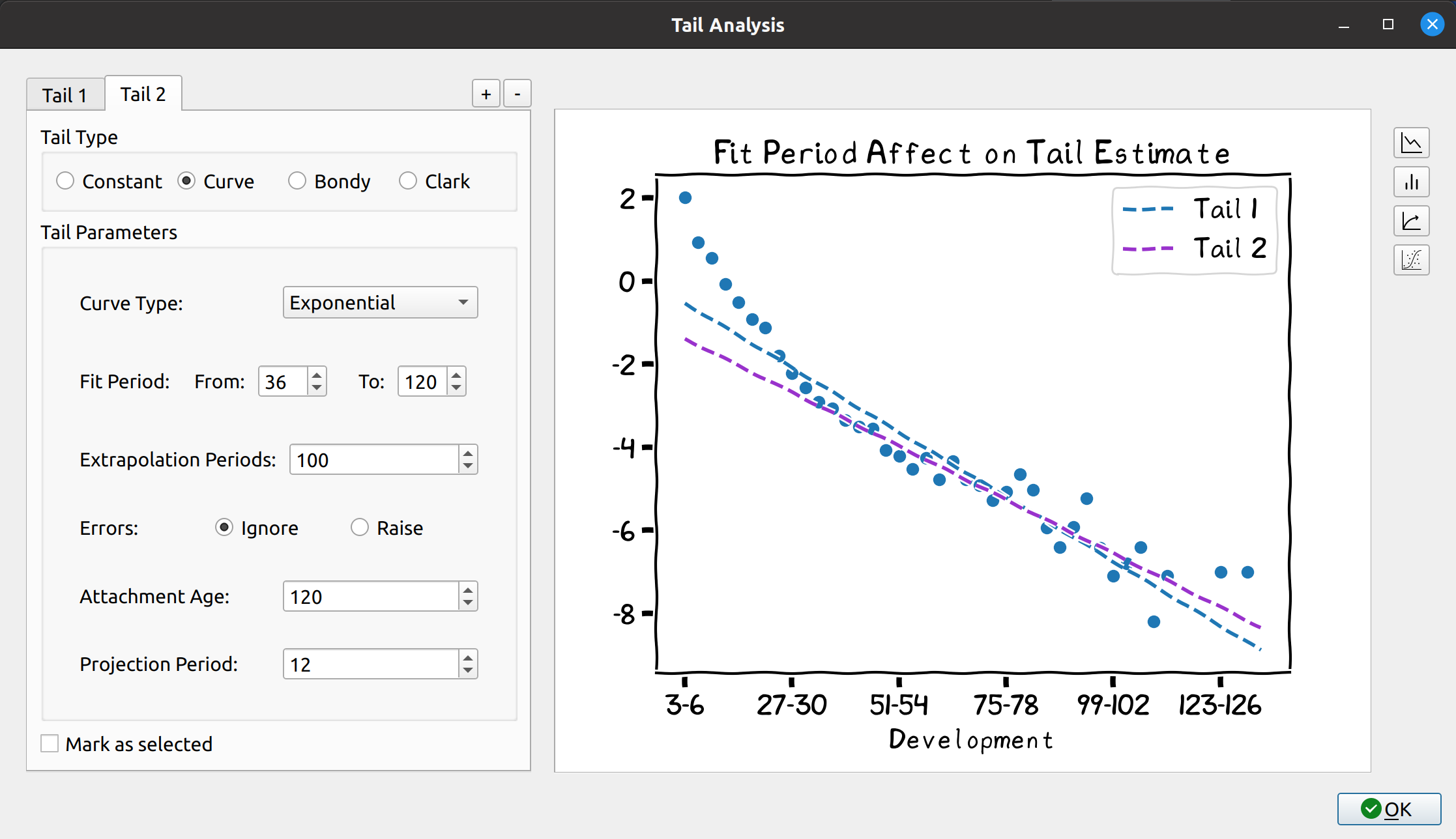
…into this!
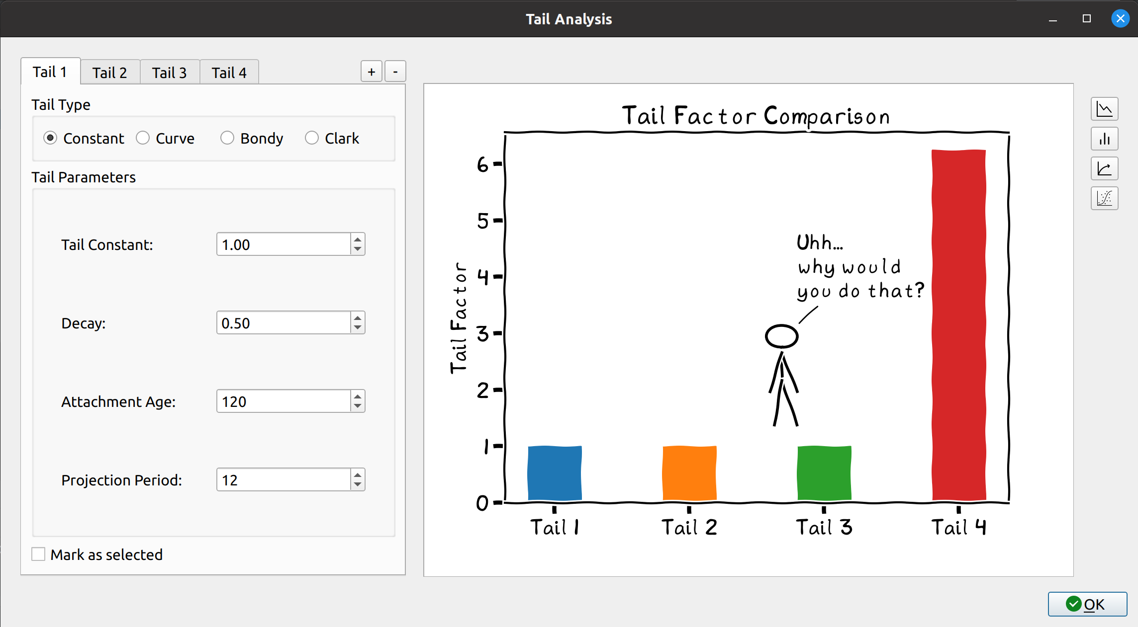
…and this!
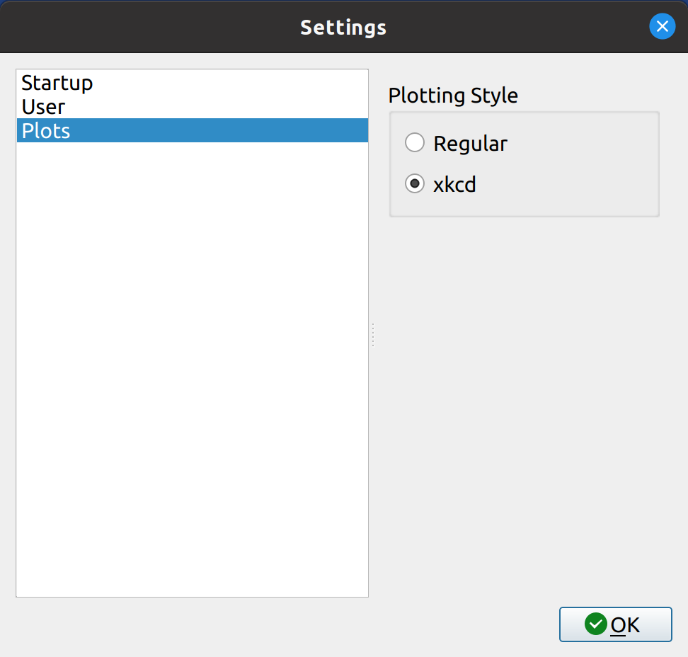
To turn on xkcd charts, go to the settings menu, navigate to plots, and select the xkcd option:
To go back, click on the “Regu-, nah you’re not gonna do that.
Enjoy!
If you are new to FASLR, it stands for “Free Actuarial System for Loss Reserving.” The source code can be found on the CAS GitHub. For those interested in seeing what FASLR can do, check out the gallery. If you would like to contribute, check out the Contributing Guide. Otherwise, visit the Development Blog for further updates.